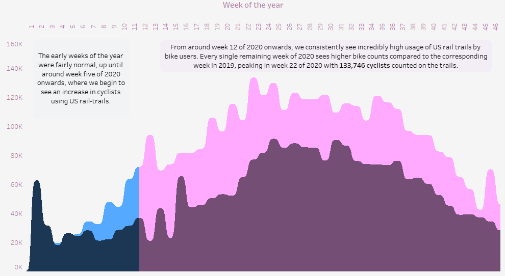
Not going to go into a great deal of detail on this one. It’s a relatively straightforward visualisation of the dataset made available for the first #MakeOverMonday project of 2021.
We were asked to visualise rail trail usage data in the United States during 2020 and this is what I came up with:
This was more about experimentation than anything else. I spent quite a lot of time getting the curvy/sigmoid area charts to work properly (thanks to Tableau Magic for the useful instructions). I’m still not totally sure if I like them or not yet.
I little to no time on anything else (such as the headers and descriptions), so I think it looks a bit naff, but c’est la vie. MakeOverMonday is suppose to be something done quickly anyway, so I’m still keeping it out there. I learned something, so thats a win.
In the meantime, you can view the completed visualisation here by clicking the link below:
Comments