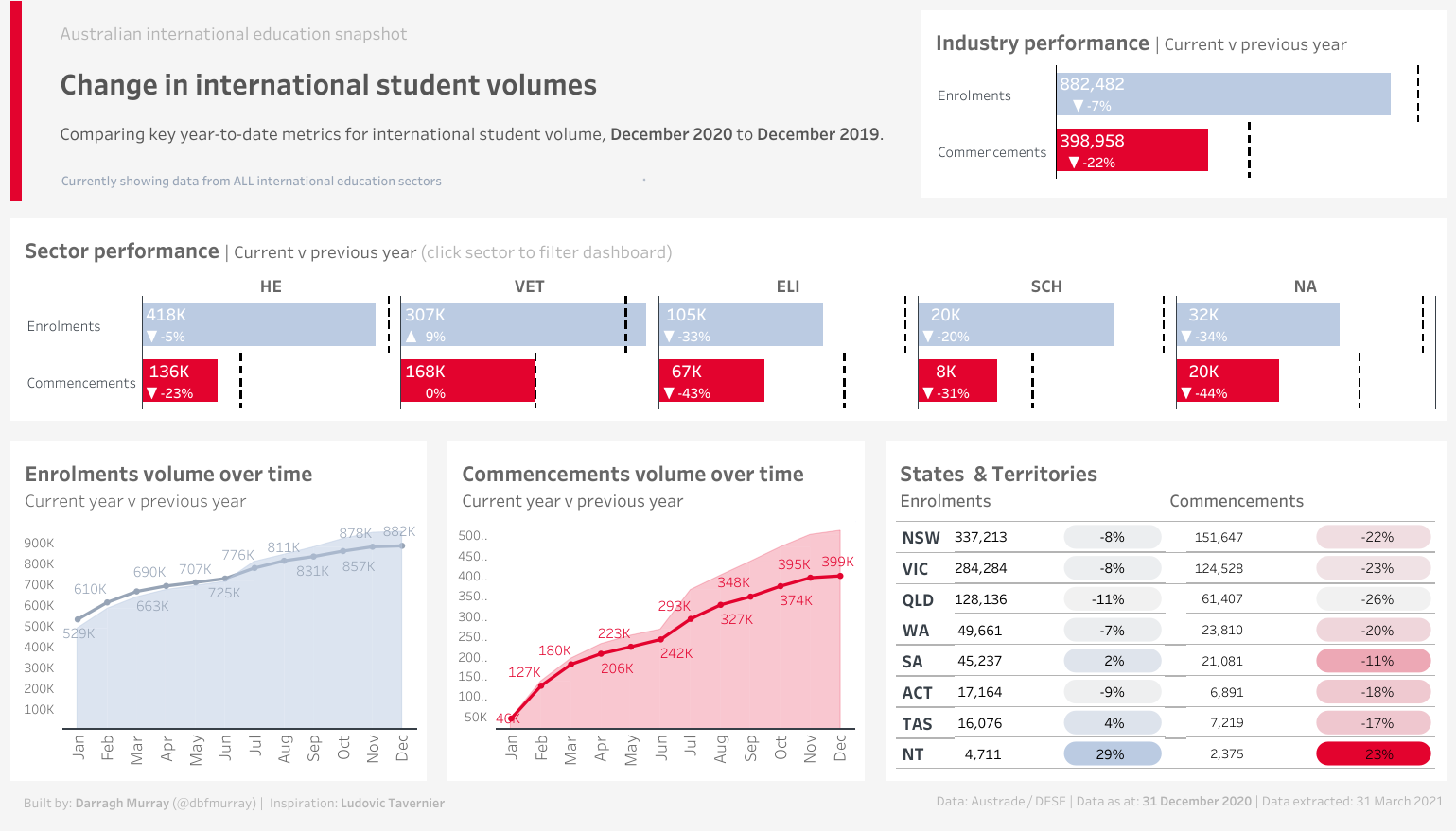
I finally got around to updating my Australian international education snapshot dashboard. The original one, while I think was somewhat novel at the time, suffered from a fair few design flaws. Also, it didn’t render very well on Tableau Public.
Since I originally did that viz, I’ve come quite some way in my Tableau abilities. This dashboard came out of reading some of the thoughts of Robert Janezic, specifically his post “Modern Dashboard Design”, which is well worth a read.
In that post, he links to a great looking dashboard by Ludovic Tavernier. I ended up borrowing a few concepts from Ludovic, in particular the really cool looking table with these ‘pill’ like highlights. So in some ways, this dashboard has elements of tribute to Ludovic.
This uses a publically available dataset made available by Austrade. Data was transformed using my new favourite language, R (specifically TidyVerse). Then everything else done in Tableau Public.
I appreciate that many of the elements adn terms used on the dashboard will only really make sense to those who work in Australian international education. I’ll be putting in some extra features in due course (such as source country data) as well as a glossary that helps those who don’t work in the industry understand it all.
So late last week, I dipped my toes into the Tidyverse ocean for the first time. If you’ve never heard of the Tidyverse, let me quickly get you up to speed: it’s a collection of packages designed for data science within the R ecosystem (if you don’t know what R is, it’s a programming language heavily orientated towards statistical computing).
Beyond the learning curve, the love-hate relationship manifested in two critical ways.
Firstly, I often encountered frustrating issues getting R and R Studio to run correctly. I don't know how many times I stopped using it after hitting error messages when merely trying to install basic packages.
Secondly, when I did get it going, I wasn't using it for things that benefitted me often, but using it to practice machine learning techniques (like Bayesian classifications and regressions). These are all well and good, but it's not like I use these functions frequently. I can count the number of regressions I've done in the last seven years on the one hand.
For a long time, R wasn’t something I needed to do my work. But things have changed over the last year as I find myself more and more engaged in doing a lot of data-science adjacent work. Being efficient and consistent when cleansing data suddenly is a crucial thing.
I frequently require to cleanse data. Typically, I rely on tools like Excel, PowerQuery and Tableau Prep to do so. As any data person knows, data cleansing is the most time-consuming part of the job - but it’s also incredibly crucial to get right. It’s also sometimes mind-numbing and prone to errors. Anything that can reduce the time to accurately clean datasets is a desirable proposition.
Lately, I’ve been working with more extensive and more complex datasets and was getting frustrated by PowerQuery and Tableau Prep’s performance. While I could set up cleansing workflows on these platforms quickly enough, I encountered issues when working with data with many millions of rows. Frequently, these products would demand colossal system resources and often crash.
After joining a Slack channel with many enthusiastic R users (shoutout to runapp), I finally decided to give it a go again - this time focusing on using Tidyverse to do a bit of essential dataset cleansing. And now I’m thrilled I took the time to experiment.
These data contain historical records of every country’s population from 1950 to the present day plus forecasts up to the year 2100. For each of these years, the data is separated into individual age brackets. For example, I can use these data to see the projected number of 18 years old in Nigeria in 2100 if I wanted.
So basically, these data contained [150 years] * [100 age groups] * [All countries plus some country groupings]. The result? 7,000,000 observations in two text files totalling over 500 megabytes. These files are enormous.
My job was to join these files together, remove the unneeded rows and columns, aggregate the data into a specific age group (separate from the UN’s usual groupings) and then output the data in a new file.
While PowerQuery and Tableau Prep can process these files, the cleaning flow took a long time to design, an exceptionally long time to run and frequently crashed my reasonably high-end PC. These problems evaporated once I got my head around the essential cleansing functions available in R and Tidyverse.
Here’s some example code that quickly allows me to load two large text files, remove unneeded columns and then merge them.
library(Tidyverse)library(readr)# Read in population data covering the years 2020 through 2050, skipping unneeded columns
pop_1950_2019<-read_csv("PopulationFile1_1950_2019.csv",col_types=cols(LocID=col_skip(),AgeGrpSpan=col_skip(),AgeGrpStart=col_skip(),MidPeriod=col_skip(),PopFemale=col_skip(),PopMale=col_skip(),VarID=col_skip(),Variant=col_skip()))# Read in population data covering the years 2020 through 2050, skipping unneeded columns
pop_2020_2100<-read_csv("PopulationFile2_2020_2100.csv",col_types=cols(LocID=col_skip(),AgeGrpSpan=col_skip(),AgeGrpStart=col_skip(),MidPeriod=col_skip(),PopFemale=col_skip(),PopMale=col_skip(),VarID=col_skip(),Variant=col_skip()))# Now bind these two dataframes together to form one big dataset with all population observations
pop_1950_2050<-bind_rows(pop_2020_2100,pop_1950_2019)
The above code uses of the readr package to import the files and then dplyr to do the merging. Both these packages live in the Tidyverse
My next task was to create some custom age groupings by aggregating the data and drop all data outside the year range of 2000 to 2050. Boom, one line of code!
# Filter out the unneeded years and age groups. We only need the years 2000-2050 and age groups 20 to 41.
pop_2020_2050_20_41_yr_old<-pop_1950_2050%>%filter(Time>=2000&Time<=2050&AgeGrp>=20&AgeGrp<=41)
Next, I wanted to aggregate all my data into a new age group category “20 to 41” and summarise it by country and year and then output it to a new csv file for use in another application. Again, R/Tidy makes this easy.
# Aggregate the age group data by location (country) and time (year)
output_pop_2020_2050_20_41_yr_old<-group_by(pop_2020_2050_20_41_yr_old,Location,Time)%>%summarise(pop_2020_2050_20_41_yr_old=sum(PopTotal))write_excel_csv(output_pop_2020_2050_20_41_yr_old,"output_pop_2020_2050_20_41_yr_old.csv")
And viola! Basic data cleansing done. Now on the press of a button (assuming the source data structure does not change), I can get my data into the correct shape in seconds and even faster than the time it would take me to load up the source datasets in excel/powerquery/Tableau Prep and do the exact same thing.
The above example is basic and scratching the surface of what is possible with R and Tidyverse but it’s incredibly useful and saves hours/weeks of work over a long period.
I suspect I’ll continue to play in the Tidyverse space for some time going forward and hopefully I’ll find the time to document some of the journey here.
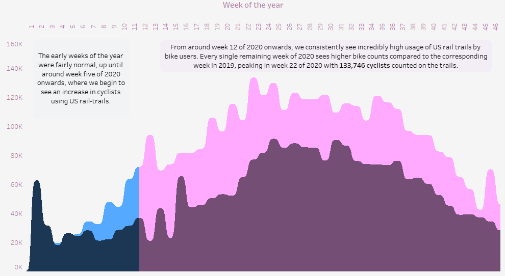
Not going to go into a great deal of detail on this one. It’s a relatively straightforward visualisation of the dataset made available for the first #MakeOverMonday project of 2021.
We were asked to visualise rail trail usage data in the United States during 2020 and this is what I came up with:
This was more about experimentation than anything else. I spent quite a lot of time getting the curvy/sigmoid area charts to work properly (thanks to Tableau Magic for the useful instructions). I’m still not totally sure if I like them or not yet.
I little to no time on anything else (such as the headers and descriptions), so I think it looks a bit naff, but c’est la vie. MakeOverMonday is suppose to be something done quickly anyway, so I’m still keeping it out there. I learned something, so thats a win.
In the meantime, you can view the completed visualisation here by clicking the link below:
I love curated email newsletters. I subscribe to many and they definitely increase my enjoyment of the web. While social media does have quite a bit of great content on it, it’s noisy and the good stuff can be hard to find. Newsletters allow me to source better content through trusted voices. All signal, little noise.
For quite some time, I’ve been thinking about starting my own newsletter, but I had struggled to think of an idea I might be passionate enough about to write consistently about. That is until I started doing a few volunteer projects with Viz For Social Good, an endeavour that seeks to “harness the power of data visualisation for social change”.
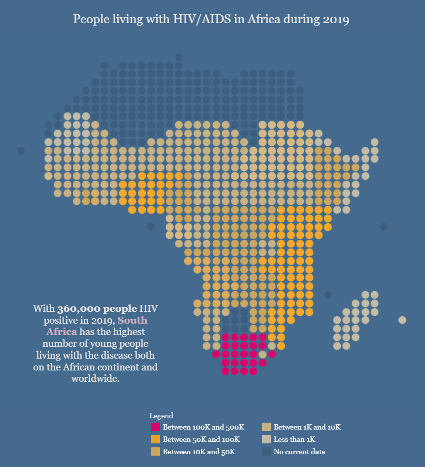
I did a few of my own visualisations, including this one examining the impact of climate change on forced migration, and it got me thinking: “this area is really exciting - I would love to write about this.”
And finally, it’s come to pass. I’ve just published the first edition of my new newsletter The Datavist via Substack. In this edition, I’m simply sharing a few links to great stories which combined data visualisation on topics relevant to the humanities. It’s early days but I’m looking forward to developing it a lot more over the coming year (perhaps even yearS).